Quickstart Guide
The Dark Adaptation Plotter is a tool for creating publication-quality plots of dark adaptation data. It has a number of features for selecting data and changing the appearance of the plot. You can preview your plot before generating it, and output formats include png, pdf and eps.
Dark Adaptation Plots
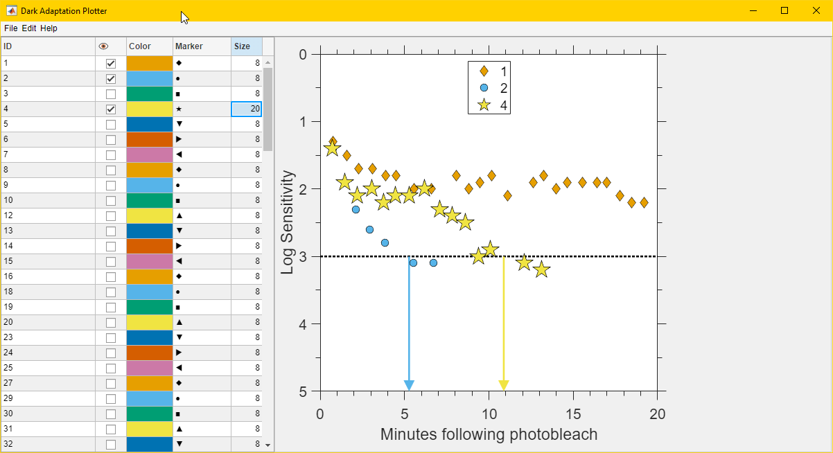
The purpose of Dark Adaptation Plots is to compare the dark adaptation recovery of patients with different markers or features of disease, especially Age-related Macular Degeneration (AMD).
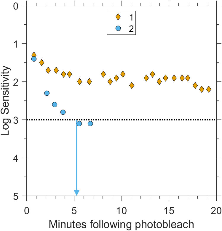
Above is a prototypical Dark Adaptation Plot. The plot is a scatter plot with arrows. The horizontal or X axis is time since the start of the experiment, and the vertical or Y axis is log sensitivity. Note that the vertical axis is flipped so that sensitivity to light increases downward. The flip is done because higher sensitivity means less light is needed to see the same target.
Each patient or subject has one set of data which generally has increasing sensitivity with increasing time so the scatter plots follow a down-right trend. Different patients will trend downward at different rates, and some may not trend downward at all in the visible space of the plot. An arrow is drawn at the location of the Rod Intercept Time (RIT) pointing to the estimated time of dark adaptation recovery. The arrow is only drawn if the RIT is within the visible X axis. The RIT will need to be supplied in the input data.
Typical Workflow
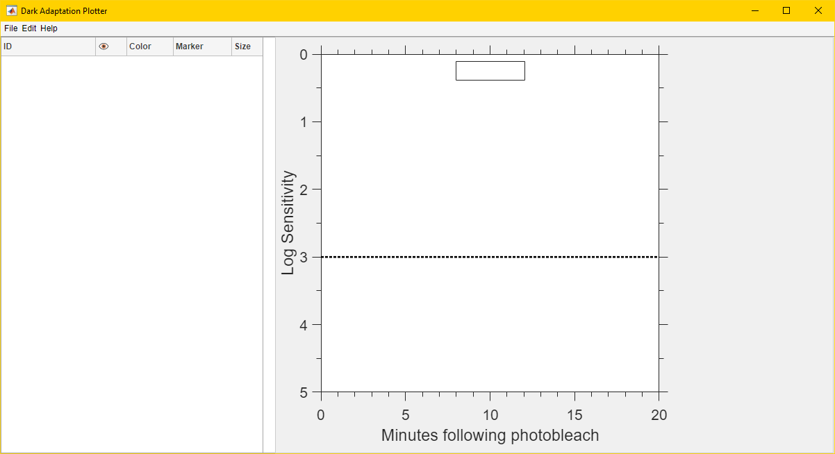
Start the application. The main window will be shown.
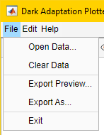
Load your data by clicking “File” and then “Open Data…” in the menu bar. Data should be in CSV format and the following fields must be available.
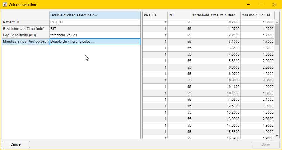
Patient ID
Rod Intercept Time (minutes)
Log Sensitivity (dB)
Minutes Since Photobleach
The columns can have any name and will be selected in the next step.
Select which columns in your file contain which fields by double-clicking in the second column of the left hand panel, labeled “Double click to select below”. When you are done, click “Done”.
After a moment, the table on the left hand side of the main window will fill out.
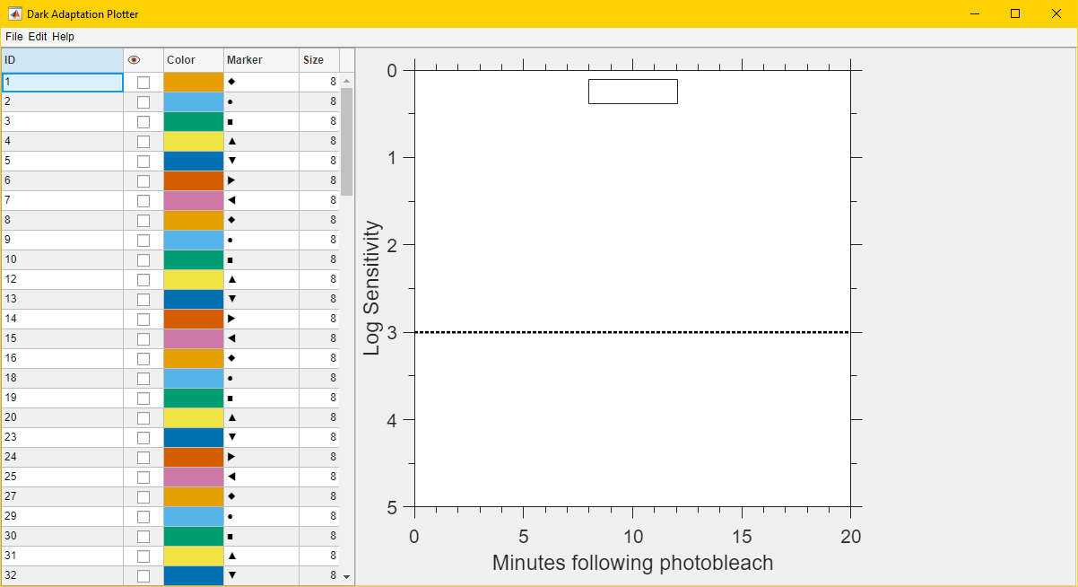
Interact with the elements of the table to customize your data selection and appearance.
Scroll up and down in the table if there is more data than can be shown in one page.
Click the checkboxes in the cells in the “eye” column to select which data rows should be visible.
Double-click on a colored cell in the “color” column to open a color picker for that data row. There is a known-issue that once a box is selected and the color picker is opened and closed, the picker can’t be reopened while that cell is selected. Select another cell and then try again.
Double-click on a cell in the “marker” column to select a different marker for that data row.
Click on a cell in the “size” column to change the marker size for that data row.
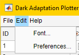
Further customization can be performed using tools in the “Edit” menu in the menu bar.
Clicking “Font…” in the “Edit” menu will open a font selection dialog, where you can change font, typeface and size.
Clicking “Preferences…” will open a dialog with additional options.
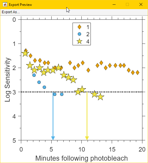
Once the plot has been customized, click “File” and then “Export Preview…” to open a new window with a preview of the plot as it will be saved. The “Export As…” menu selection in the preview window will allow exporting as in the next step. It is recommended to preview at least one plot to ensure it looks as desired before making additional plots.
Click “File” and then “Export As…” to open a save file dialog and export without previewing.